Iconography
Icons help make interfaces quick and easy to scan and understand, contributing to a smooth overall experience. They support users in identifying actions, finding their way, and completing tasks.

Our icons are not used as decoration – they are simple, functional, and reinforce a familiar Coop feeling.
On this page you find usage rules, sizing guidelines, and available icons across Coop’s digital products.
Characteristics
Our icons are clear, minimal, and designed to support navigation and understanding across Coop touchpoints.
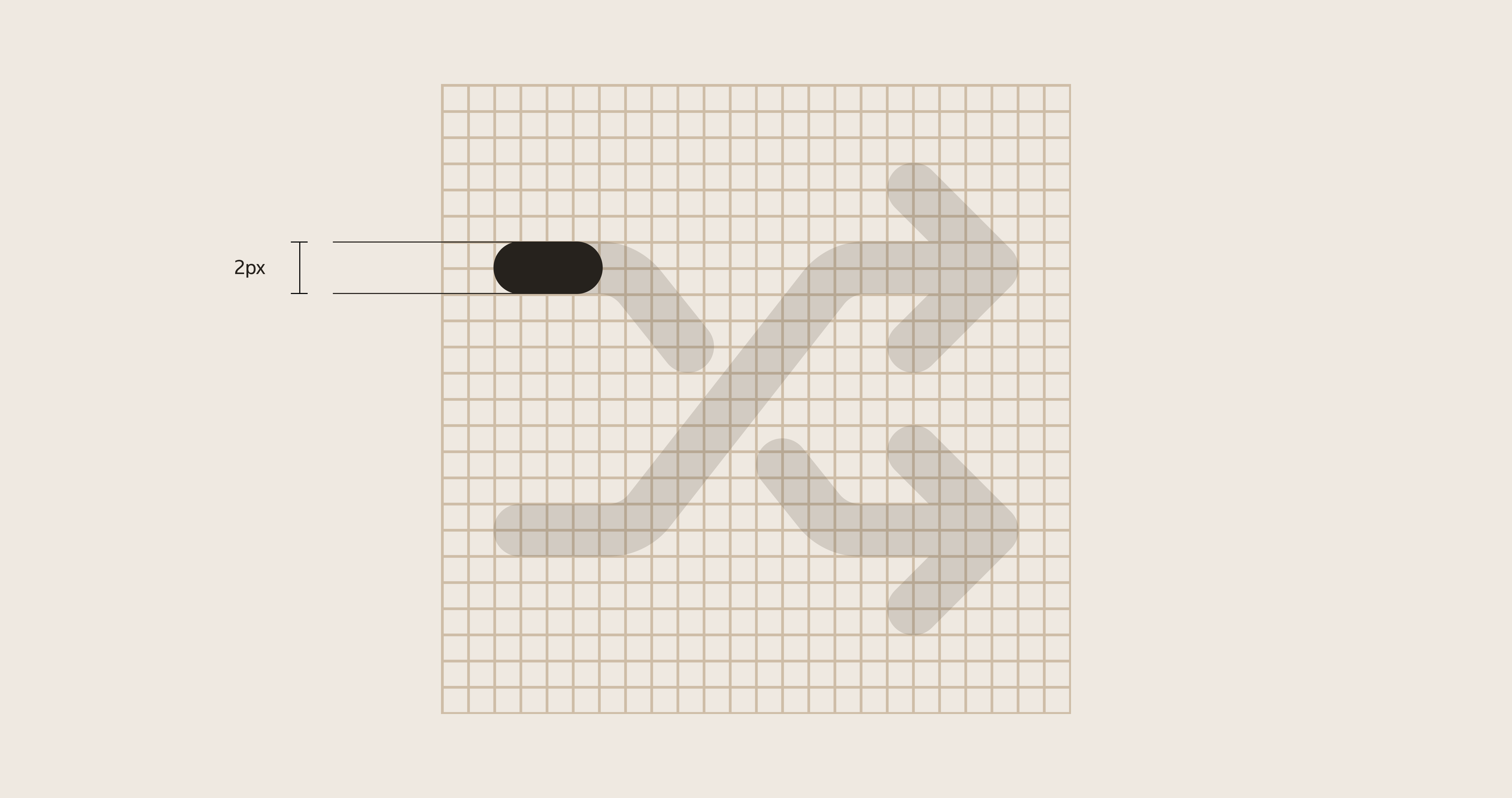
Stroke weight
Use a 2px stroke width. Icons are outlined to keep a consistent size-to-ratio relationship when scaled.
Size
Icons scale with our sizing variables.
16pxand24pxare the most common sizes.- Use larger sizes only when clarity requires it, for example in empty states.
- For larger presentation, use
64px.
Safe space
Icons follow a 24px grid and include 2px safe space on each side.

Icon library
Our full icon library is maintained in Figma: CDS 2.0 - Icons & Illustrations.
Missing an icon?
Contact the Design System team through CDS Teams channel.