Button
Buttons trigger actions. They tell users what will happen when they interact. Labels should state the action clearly.
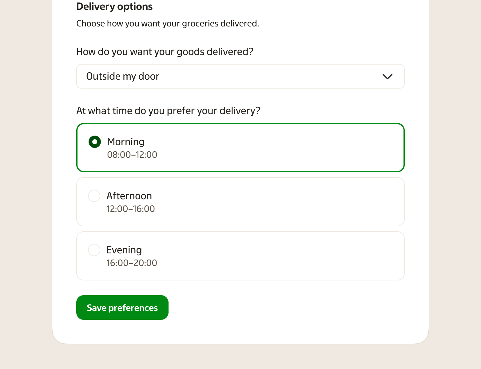
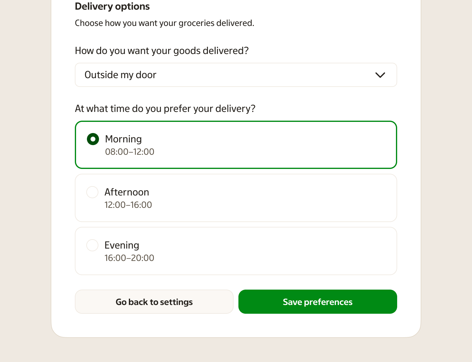
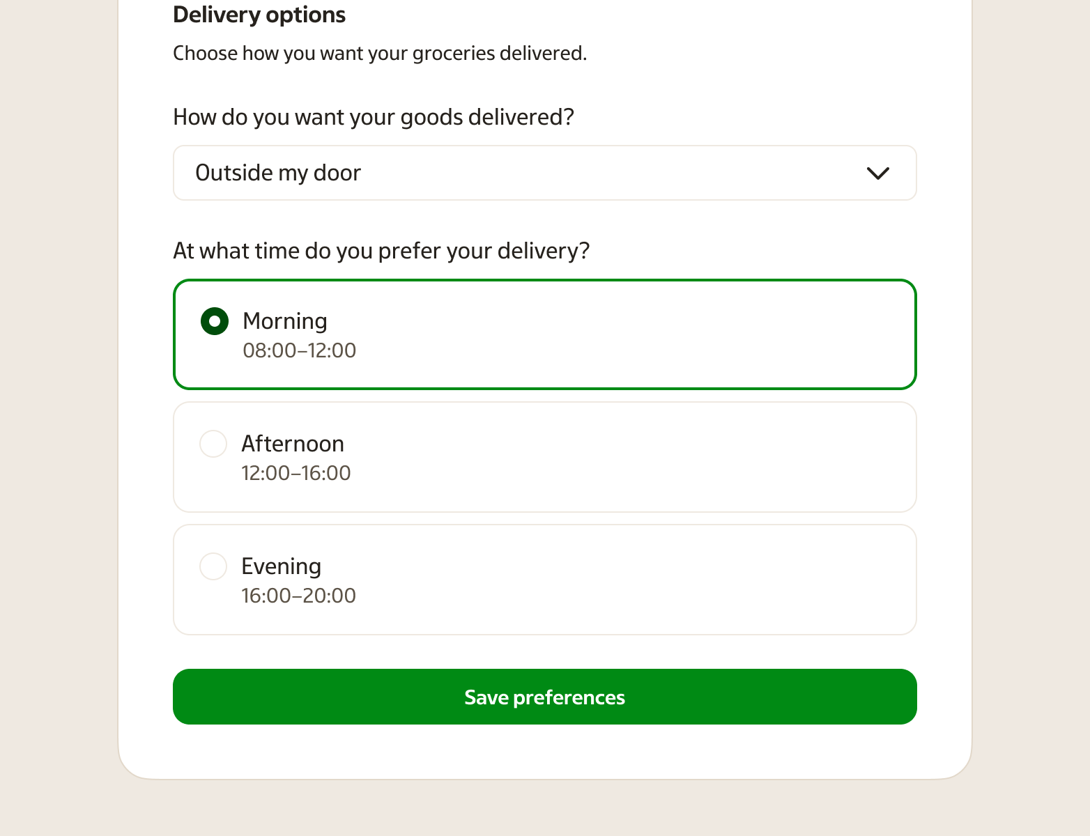
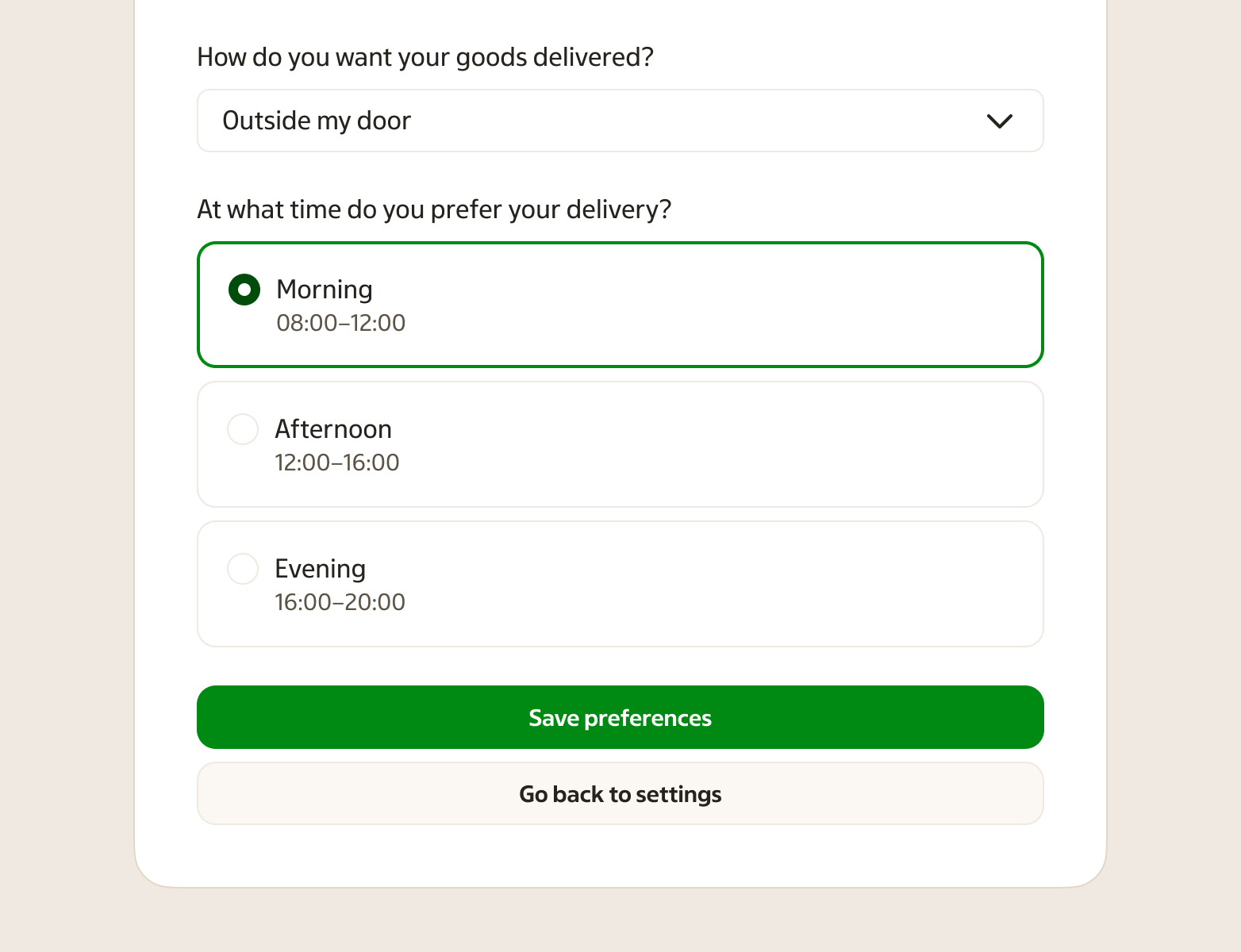
Preview
When to use
- Showing the main action on a page or in a component
- Letting users submit forms, confirm actions, or start a process
- Creating clear hierarchy among several actions
- Highlighting a destructive or critical action
When not to use
- Screens with several equally primary actions; use one primary button per screen.
- Secondary actions; use a lower-emphasis variant.
- More than one primary button per screen.
- Navigation; use links for moving between pages.
- Options with a persistent selected state (for example quick filters or formatting options) — use a Toggle button.
- A small set of related options presented as one control (segmented control) — use a Toggle button group.
- A setting that reads as “On/Off” in a form or settings screen — use a Switch.
- Buttons that are too small on touch devices; ensure adequate tap size.
- States that rely only on colour; support meaning with text and contrast.
- Vague labels like "Click here" or "Submit" without context.
- Disabled buttons without explaining why or what enables them.
- Inconsistent icon usage within a group.
- Actions that take time but have no loading state.
- Interfaces where focus is hidden; keyboard users need a visible focus indicator.
- Mixed sizes in a group without a clear hierarchy reason.
Behaviour
Click or tap runs the action. Keyboard: Enter or Space activates when focused. Hover shows the button is interactive. Focus is visible so keyboard users can see where they are.
Disabled buttons do not respond. Loading state should block multiple submissions. Focus state must be clearly visible.
Anatomy
- Container — Outer shape that defines background, border, and size. Style varies by variant and state.
- Label — Text that describes the action. Left-aligned, concise.
- Icon (optional) — Icon to the right of the label. Use only when it clarifies the action.
Variants
Each variant signals a different role. Use them consistently so users understand what each button does.
| Variant | Purpose | Use case |
|---|---|---|
| Primary | Main call to action. Use once per screen (excluding header, modal, or side panel). | Submit, confirm, continue |
| Secondary | Supporting action, often the negative side of a pair (e.g. Cancel, Back). Use with a primary. | Cancel, go back, alternative option |
| Outlined | Less prominent but still clearly defined. Border, transparent background. | Secondary or less critical actions |
| Inverse | For dark backgrounds. Light text on dark. | Buttons on dark surfaces |
| Outlined-inverse | Outlined style on dark backgrounds. | Outlined actions on dark surfaces |
| Critical | Needs attention but not destructive. Warning-style treatment. | Important warnings |
| Destructive | Irreversible or harmful to user data (e.g. delete, remove). | Delete, remove, permanent actions |
Sizes
| Size | Use case |
|---|---|
| Small | Tight vertical space or compact layout. Pairs with small inputs. |
| Default | Most common. Standard actions. Pairs with medium inputs. |
| Large | When the button should stand out or pair with large inputs. |
| 4xLarge | When the button spans the width of a narrow container (e.g. modal, side panel, tearsheet). |
States
- Default — Ready for interaction
- Hover — Pointer over the button
- Pressed — During click or tap
- Loading — Action in progress; may show a spinner and block repeat taps
- Disabled — Not available; no click or keyboard response
Placement & layout
Desktop placements
In overviews and widgets, place button groups on the left and put the primary action furthest left to match top-to-bottom reading. In dialogs and step-by-step flows, place button groups on the right and put the primary action furthest right to support forward movement (in western culture, left to right).
Mobile placements
With one button, use full width of the content area. With two buttons, place them side by side when possible; if they stack, place the primary button first and the secondary button after.
Inside components
In notifications, search, tables, etc., buttons are typically left-aligned with the component.
When several buttons sit together, keep spacing consistent and hierarchy clear. One primary per group; secondary and outlined can sit next to it. On narrow layouts (e.g. mobile, side panels), full-width buttons are often used for better tap targets.
Accessibility
Buttons must be keyboard accessible with a visible focus state. Labels should describe the action (e.g. "Save changes" rather than "Save" when context matters). Text and background meet contrast requirements. On touch devices, buttons meet minimum touch target size; small buttons may need extra padding.
Screen reader — Use descriptive labels. Indicate loading and disabled state.
Visual indicators — Focus ring must be visible. Don't rely on colour alone for meaning.
Related components
- Link — Use for navigation to another page.
- Icon button — Use when space is limited and the icon is widely recognised (with tooltip).
- Toggle button — Use for options with a persistent selected state (for example quick filters).
- Toggle button group — Use for a small set of related options that should feel like one control.