Toggle button
Toggle buttons let users switch something on or off, or quickly apply and remove an option.
When to use
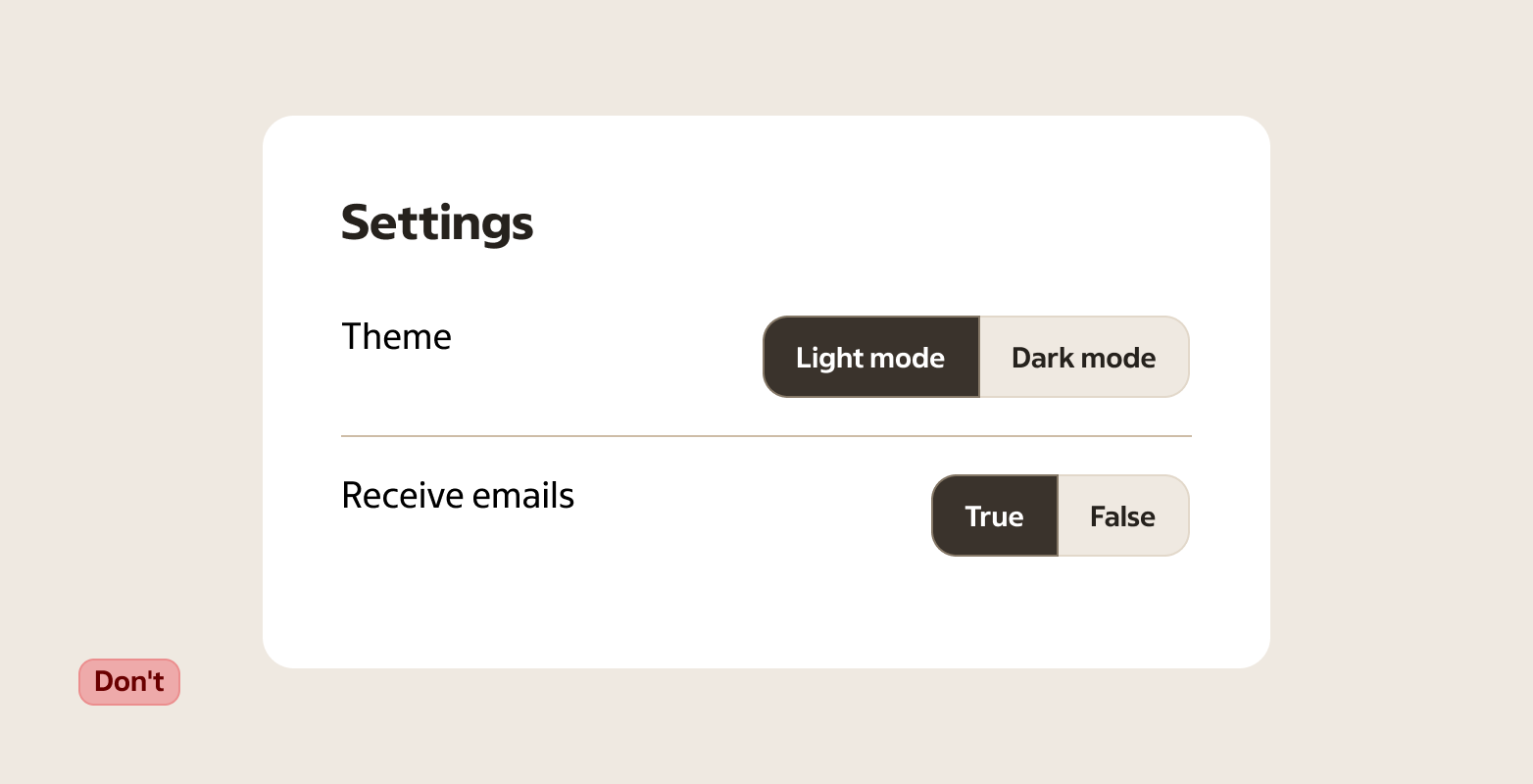
Use a toggle button for inline options and quick filters where the state should stay visible. For settings and form fields that read as “On/Off”, use a Switch.
- Turning a setting on or off without leaving the current context
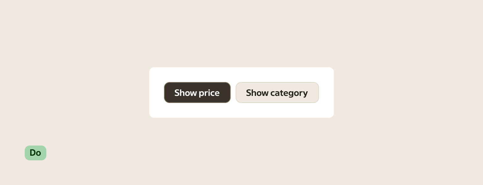
- Letting users apply or remove an option (for example “Show prices”, “Include out-of-stock”)
- Quick actions where the current state should stay visible after interaction
- Icon-only actions when the meaning is widely recognised (and still has an accessible label)
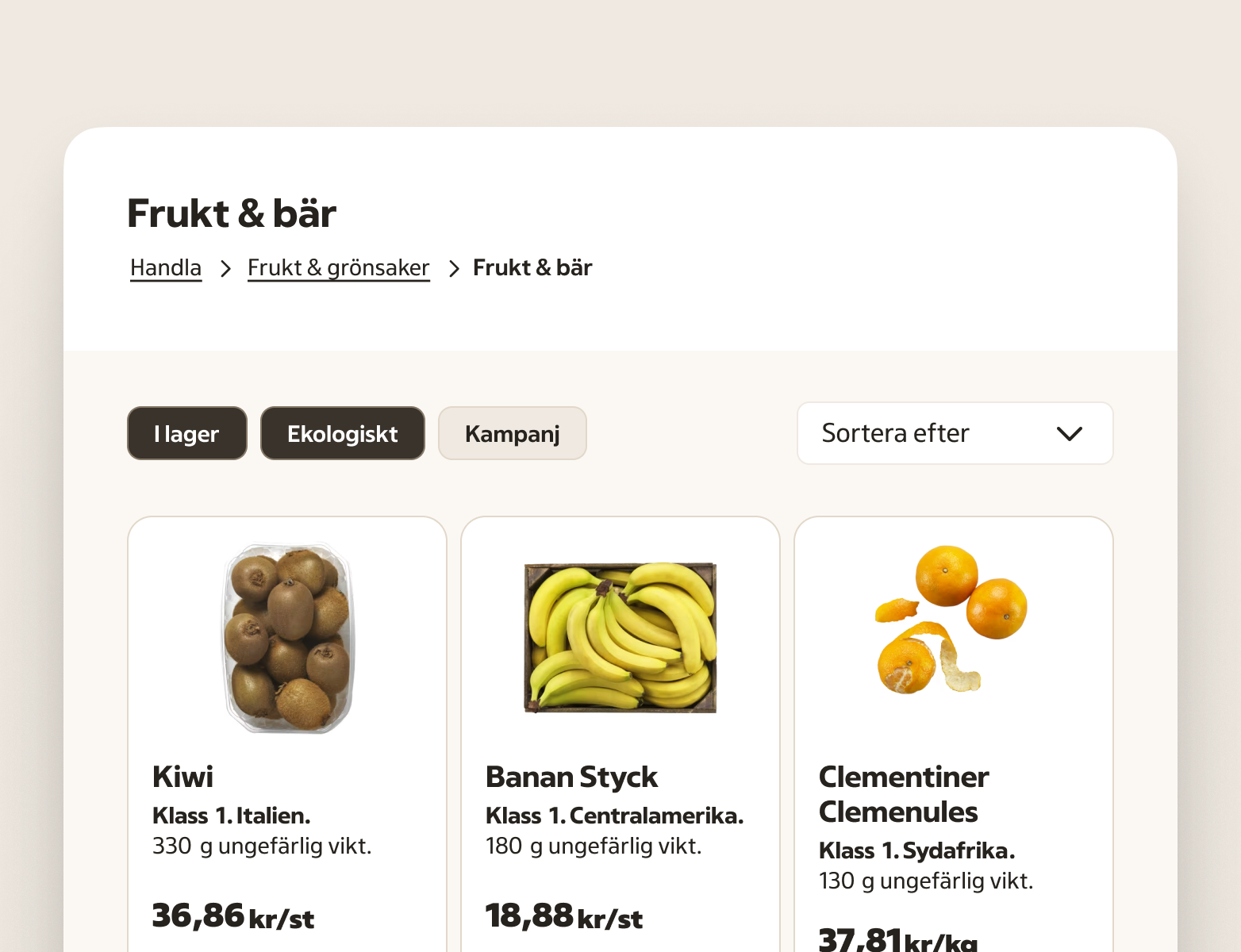
- Quick filters that update results immediately (for example “I lager”, “Ekologiskt”)
When not to use
- A setting in a form or settings screen that reads as “On/Off” — use a Switch
- Short, binary choices (for example “Ja / Nej”) — use Radio or a Switch depending on whether it’s a choice or a setting
- Primary actions like “Save”, “Continue”, or “Pay” — use a Button
- Single-select choices between options (for example “Small / Medium / Large”) — use a Radio or a Select
- Multi-select lists with many options — use Checkbox or Listbox
- Navigation between views — use Tabs or Link
- Filters with many sections or long option lists — use Checkbox and Radio so the structure is easier to scan
- Showing applied filters as removable items — use Tag (dismissible tags in a tag group)
Behaviour
A toggle button has two meanings: selected and not selected.
When the user activates it, the state changes and stays changed until the user toggles it again. The label and/or icon should make it clear what the state means.
If the action triggers something that takes time, keep the state predictable. Avoid patterns where the button appears selected but the underlying change failed.
Use a toggle button when the user should see the current state inline (for example in a toolbar or as a quick filter). Use a Switch when it’s a setting the user turns on or off, especially in settings and forms.
Avoid adding extra selection indicators (like checkmarks) inside the button. The selected state of the toggle button is the indicator.
Accessibility
- The state must be communicated to assistive technology (selected vs not selected).
- If the control is icon-only, provide an accessible name that explains the option (for example “Show prices”).
- Ensure keyboard users can reach and operate the control, with a visible focus indicator.
- With a keyboard, Space/Enter toggles the state and Tab moves focus on.
Anatomy
- Container — the tappable area that receives focus and shows state
- Label (optional) — short text describing what toggles
- Icon (optional) — use when it clarifies the meaning; icon-only buttons still need an accessible label
Variants
Content type
- Text — use for most cases. Keep labels short and specific.
- Icon — use when the icon is standard and unambiguous in your context.
Content guidance
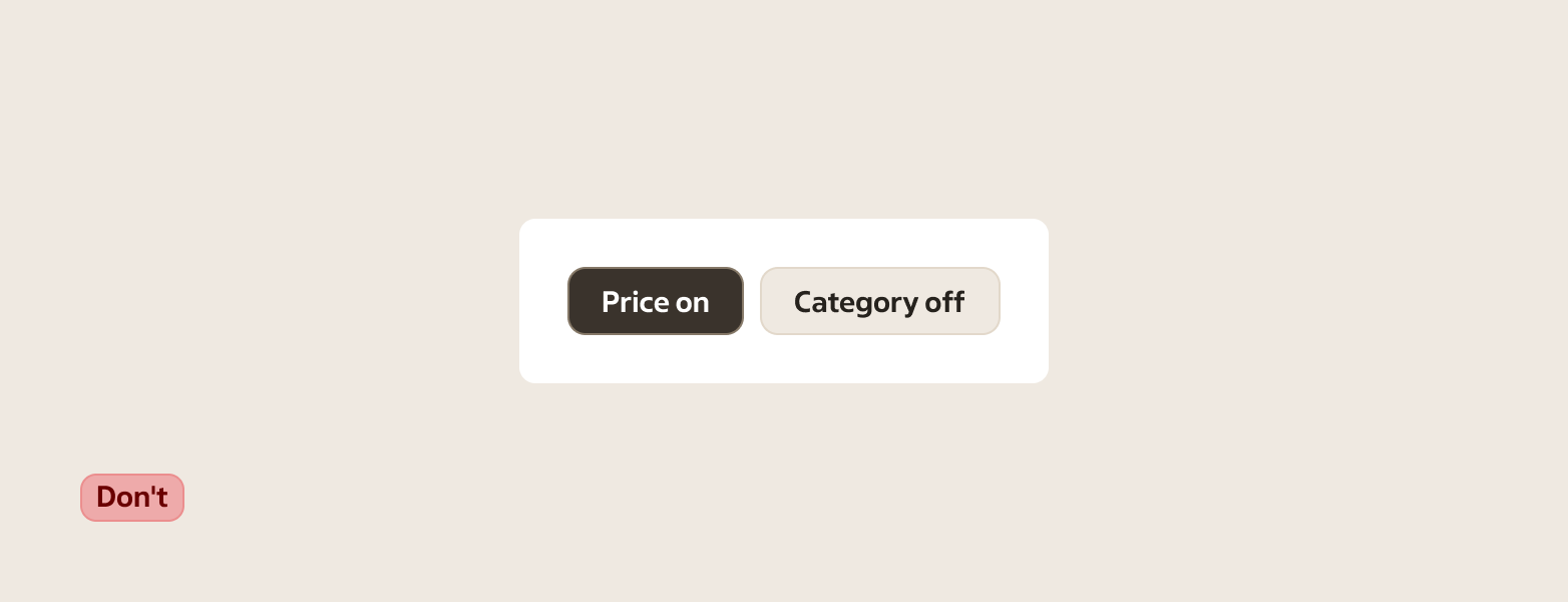
- Write the label as the option, not the state (for example “Show prices”, not “Prices on”).
- Avoid negations when you can (for example prefer “Include out-of-stock” over “Hide out-of-stock”).
- Keep labels short and scannable. If you need a sentence to explain it, use a different pattern.
- Example (coop.se): write “Visa erbjudanden” rather than “Erbjudanden på”.
Sizes
Use a size that matches nearby controls.
- Small — compact spaces and dense toolbars
- Default — the standard choice in most layouts
- Large — prominent surfaces or when paired with large inputs
States
| State | When to use |
|---|---|
| Default (not selected) | When the option is available and currently not applied. |
| Selected | When the option is currently applied. |
| Disabled | When the option isn’t available right now and can’t be toggled. |
| Hover | When a pointing device is over the button. |
| Focus | When the button has focus from keyboard navigation or assistive technology. |
| Pressed | While the user is activating the button, before the interaction completes. |
Placement & layout
Use toggle buttons where the user can immediately see the effect of changing the state. When multiple toggles sit together, keep them aligned and use consistent sizing.
If you need a set of related toggles or a segmented control (one category/dimension of choices), use Toggle button group.
If you have several independent quick filters (different categories, each meaningful on its own), use separate toggle buttons rather than grouping them.
Related components
- Toggle button group
- Switch — for a setting that reads like “On/Off”
- Checkbox — for multi-select in forms and lists
- Button — for actions that don’t have a persistent selected state