Toggle button group
Toggle button groups organise related toggle buttons so users can make a quick choice within a set.
Figma
Toggle button group specification in Figma.
Storybook
Toggle button group specification in Storybook.
A toggle button group is a compact way to present a small set of related options with clear “selected / not selected” feedback.
When to use
- Grouping a small set of related toggles (typically 2–4) so they feel like one control
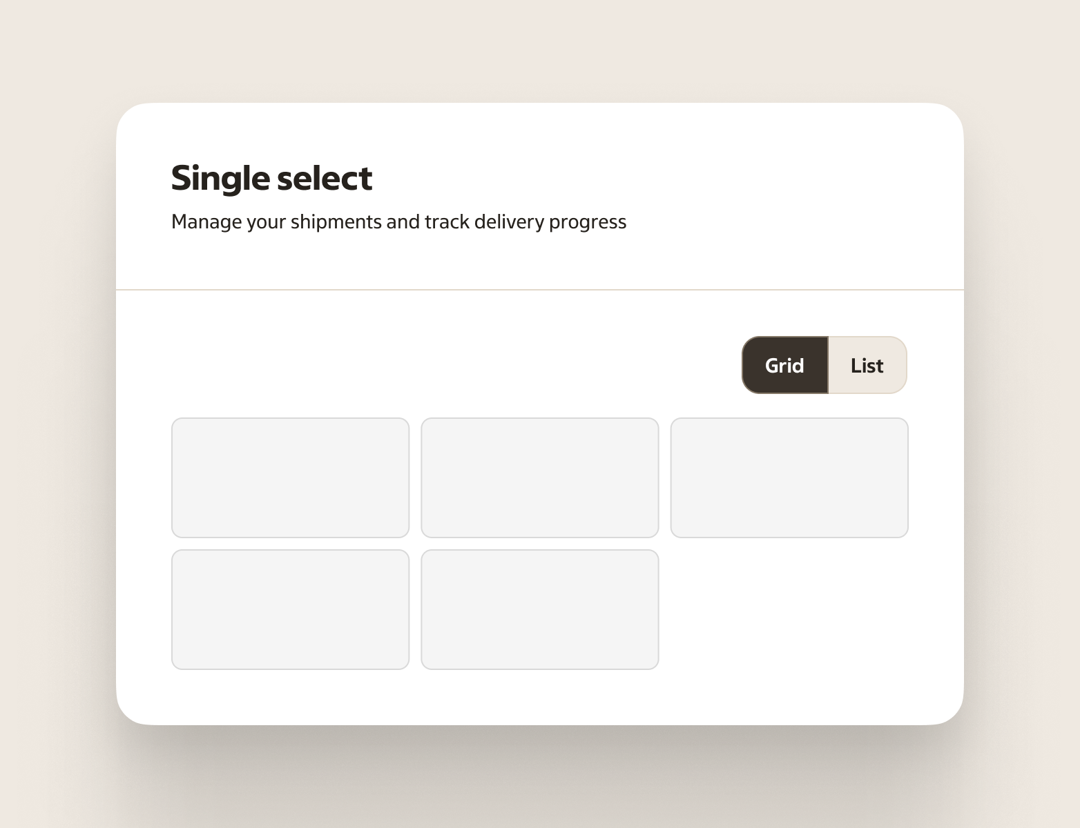
- A segmented control where one option should be selected at a time (for example “Day / Week / Month”)
- A compact set of filters within the same category where multiple options can be applied
- When the choices stand on their own and need extra visual emphasis (more than a plain list of radios/checkboxes)
- Quick filters when the selection should be visible and update results immediately
When not to use
- Long or complex option sets — use Checkbox, Radio, Select, or Listbox
- When the options represent navigation between views — use Tabs
- When the options need additional descriptions per item — a list-based control is usually clearer
- Short, binary choices (for example “Ja / Nej”) — use Radio or Switch depending on whether it’s a choice or a setting
- When you have many filter sections on the same page — separate the sections with Checkbox and Radio so the structure is easier to scan
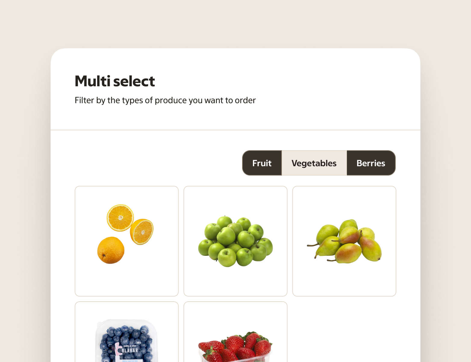
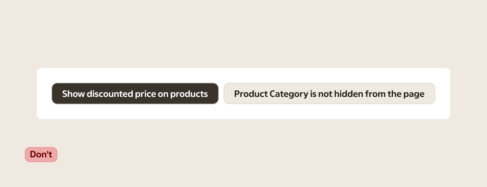
- When the options are different categories of filters (for example “Ekologiskt”, “I lager”, “Kampanj”) — use separate Toggle button controls instead of forcing them into one group
- Showing a dynamic, additive list of applied filters/selections — use Tag (dismissible tags in a tag group)
Behaviour
A toggle button group keeps related options together and helps the user understand the relationship between them.
Groups can support:
- Single selection — choosing one option makes it the active one.
- Multiple selection — each option toggles independently.
Keep the behaviour consistent within a group. Don’t mix “single selection” and “multiple selection” patterns in the same group.
Selection rules
- For single selection, decide whether the group allows none selected.
- Allow none selected when each option is an independent formatting or preference (for example “Bold / Italic / Underline”) and the user can turn everything off.
- Require exactly one selected when the group represents a mode (for example “Day / Week / Month”). In this case, always keep one option selected.
- If changing the selection moves between views or pages, it’s navigation. Use Tabs instead.
- Example: “Kundvagn / Erbjudanden / Konto” is navigation (tabs). “Dag / Vecka / Månad” is a mode inside the same view (toggle group).
- For multiple selection, each option toggles independently. If the user needs help understanding what is currently applied, a list of checkboxes is usually clearer.
Content and overflow
- Keep labels short. If labels wrap onto multiple lines, the group becomes harder to scan and can feel unstable as options change size.
- Don’t rely on long labels to explain the choice. If each option needs a description, use Radio, Checkbox, or Listbox instead.
Avoid “extra controls”
Don’t add extra selection indicators (like checkmarks, radios, or checkboxes) inside the options. The selected state of the toggle button is the indicator.
Accessibility
- Communicate state to assistive technology (selected vs not selected for each option).
- Provide a clear group label when the meaning isn’t obvious from surrounding content.
- Keyboard interaction should be predictable across platforms. Users should be able to reach each option and operate it with Space/Enter.
- Ensure a visible focus indicator, including when the group sits in toolbars or dense layouts.
Anatomy
- Group container — holds the set and keeps it visually connected
- Toggle buttons — each item is a Toggle button
Variants
Amount
- Two
- Three
- Four
Selection
- Single selection — use when options are mutually exclusive.
- Multiple selection — use when options can be combined.
Content guidance
- Keep labels parallel so the set is easy to scan (same grammar and similar length).
- Write labels as options, not states.
- Examples:
- Good: “Dag / Vecka / Månad”
- Avoid: “Dag / Veckovis / 1 månad”
- Good: “Fet / Kursiv / Understruken”
- Avoid: “Fet på / Kursiv på / Understruken på”
Sizes
Match the size to nearby controls.
- Small
- Default
- Large
States
| State | When to use |
|---|---|
| Default (not selected) | When the option is available and currently not applied. |
| Selected | When the option is currently applied or active in the group. |
| Disabled | When the option can’t be changed right now. |
| Hover | When a pointing device is over an option. |
| Focus | When an option has focus from keyboard navigation or assistive technology. |
| Pressed | While the user is activating an option, before the interaction completes. |
Placement & layout
Use groups when the options are short and comparable. Keep labels parallel (same grammar and length where possible) so the user can scan quickly.
If space is tight, prefer fewer options. More options often reads better as a list rather than a segmented control.
Keep all options the same height and width within the group. Mixed sizing makes the control harder to understand as one unit.