Split button
A two-part button that exposes one primary action and up to six closely related alternatives in a dropdown.
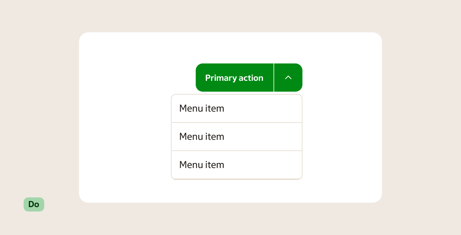
Preview
A split button combines a primary action button with a dropdown trigger. Selecting the left part runs the default action immediately; opening the right part reveals a short list of related alternatives. It is designed exclusively for categorised decisions — the options must all belong to the same decision space.
When to use
Use a split button when there is one obvious primary action and a small set of closely related alternatives that belong to the same category.
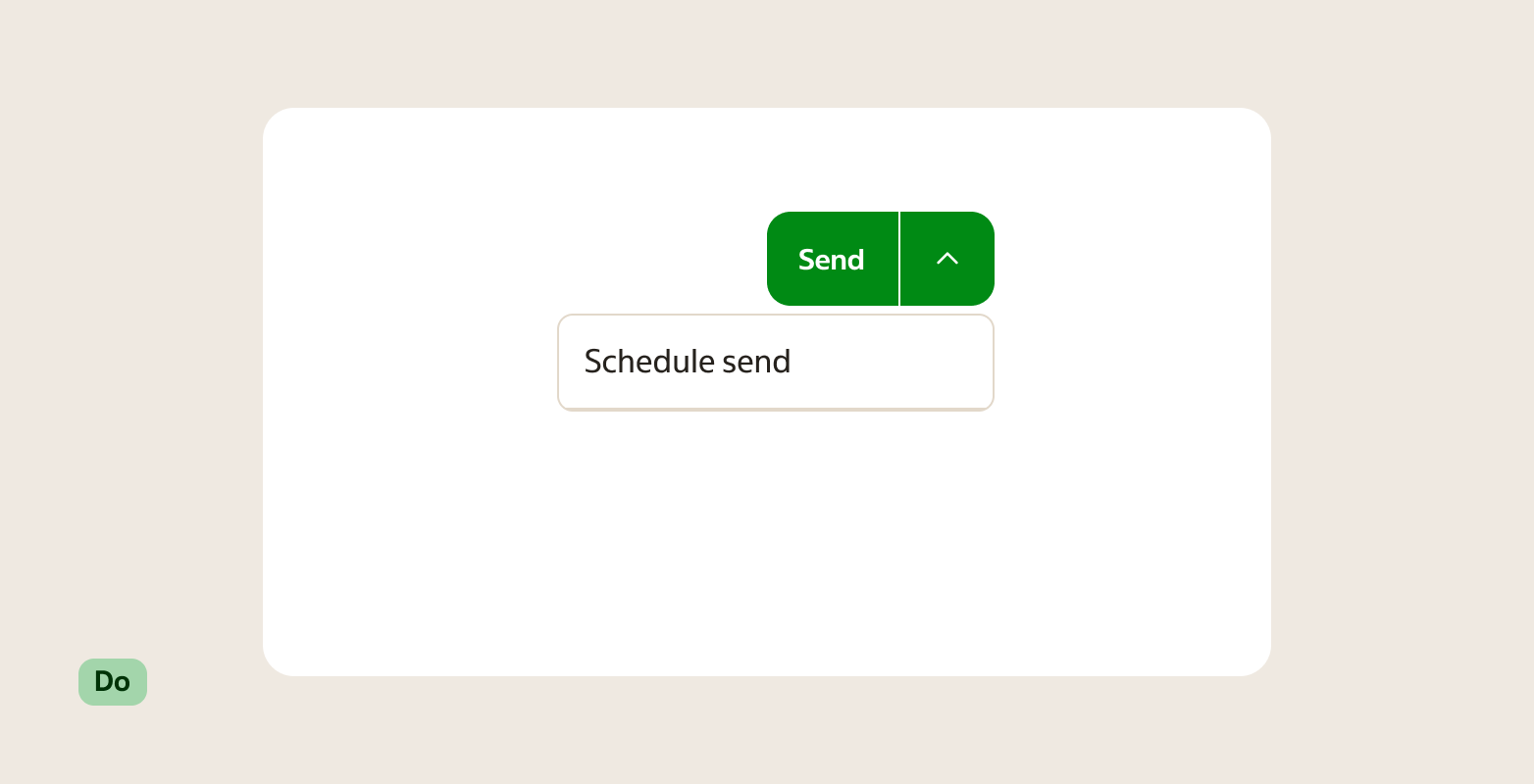
- A clear default action exists, but users occasionally need a variant of it (for example "Save" and "Save as draft", "Save and close").
- The alternatives are all part of the same category — not separate unrelated actions.
- The list of alternatives is short: between 2 and 6 options.
Rules of thumb vs the closest alternatives:
- Split button vs Button: Use Button when there is only one action. Add a split button only when the alternatives are genuinely useful and from the same category.
- Split button vs Select: Use Select when users are choosing a value (for example a status or a format). Use a split button when every option in the list is an action that runs immediately.
- Split button vs separate buttons: Use separate Buttons when the actions are from different categories. Group them as a split button only when they clearly belong together.
When not to use
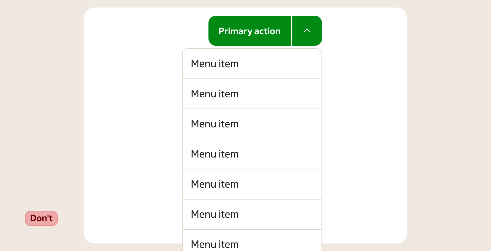
- More than six options in the dropdown — use a Select or a different menu pattern.
- Options that belong to different categories — use separate Buttons.
- Only one action — use a Button.
- Navigation between views or pages — use a Link or Tabs.
- Filtering or toggling options — use a Toggle button group.
- Choosing a value in a form — use a Select.
Behaviour
Clicking the primary (left) part of the split button runs the default action immediately, the same as a regular button click.
Clicking the dropdown trigger (right part) opens a listbox containing the related alternatives. Selecting an option from the listbox runs that action and closes the dropdown.
The dropdown closes when:
- The user selects an option.
- The user presses
Escape. - The user clicks outside the component.
The primary button label is fixed. It always shows the same action and never updates to reflect the last option used from the dropdown.
Accessibility
- The primary button and the dropdown trigger are two separate focusable controls. Both must be reachable and operable by keyboard.
- The dropdown trigger must have an accessible label that communicates its purpose independently from the primary label (for example "More actions").
- When the dropdown opens, focus moves into the listbox. Arrow keys navigate options; Space or Enter selects.
- Pressing
Escapecloses the dropdown and returns focus to the dropdown trigger. - The expanded/collapsed state of the dropdown trigger is communicated to assistive technology via
aria-expanded.
Anatomy
- Primary button — the left part. Triggers the default action directly. Shows a label; no icon.
- Divider — a visual separator between the two parts.
- Dropdown trigger — the right part. A small button (typically a chevron icon) that opens and closes the listbox.
- Listbox — the dropdown panel. Contains between 2 and 6 options, all from the same category as the primary action.
Variants
Theme
| Variant | When to use |
|---|---|
| Primary | The default. Use when the split button is the main action in the view. |
| Secondary | Use for supporting actions. |
| Subtle | Use in dense or low-emphasis contexts where a strong visual weight would distract. |
Size
Use a size that matches the surrounding controls.
| Size | When to use |
|---|---|
| Small | Compact spaces and dense toolbars. |
| Default | The standard choice in most layouts. |
| Large | Prominent surfaces or when paired with large inputs. |
States
| State | When to use |
|---|---|
| Default | The component is ready. The primary action and dropdown trigger are available. |
| Hover | A pointer is over the primary button or the dropdown trigger. Each part is hovered independently. |
| Focus | The primary button or dropdown trigger has keyboard focus. |
| Open | The dropdown trigger has been activated and the listbox is visible. |
| Disabled | The entire split button is unavailable. Both parts are non-interactive. |
Placement & layout
Place a split button where a regular button would go. It follows the same alignment rules as Button.
- One split button per action group. Don't place two split buttons side by side — it creates visual noise and makes hierarchy unclear.
- If the primary action stands clearly on its own and alternatives are rarely needed, use a regular Button instead.
- Keep the listbox options short and scannable. If an option label needs a sentence to explain it, the option probably doesn't belong here.
Content guidance
- Write the primary label as an action verb ("Save", "Export", "Send").
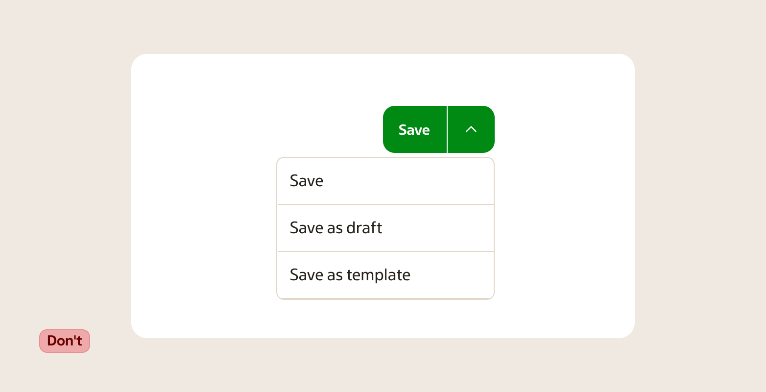
- Write each option in the listbox as a variant of the primary action. Keep grammar consistent across the full list ("Save as draft", "Save and close" — not "Draft" and "Closes and saves").
- Keep every option label short: one line, ideally 2–4 words.
- Avoid negations as option labels ("Don't send", "Not now").
- The maximum is six options in the listbox. More than six is a signal to reconsider the pattern.
- Never repeat the primary action as one of the dropdown options. If the option is the same as the primary button, it doesn't belong in the list.

- Group only related actions under the dropdown. Every option should be a logical variant or extension of the primary action.
- Don't use a split button to group actions that aren't directly related to each other — use separate Buttons instead.

Related components
- Button — for a single action without alternatives.
- Select — for choosing a value from a list, not for triggering actions.
- Listbox — the underlying list pattern used inside the split button dropdown.
- Toggle button group — for toggling between a small set of options that stay visible.