Tabs
Tabs let users switch between distinct sections of content within the same view. Only one tab is active at a time.
Preview
First
Second
Third
Fourth
When to use
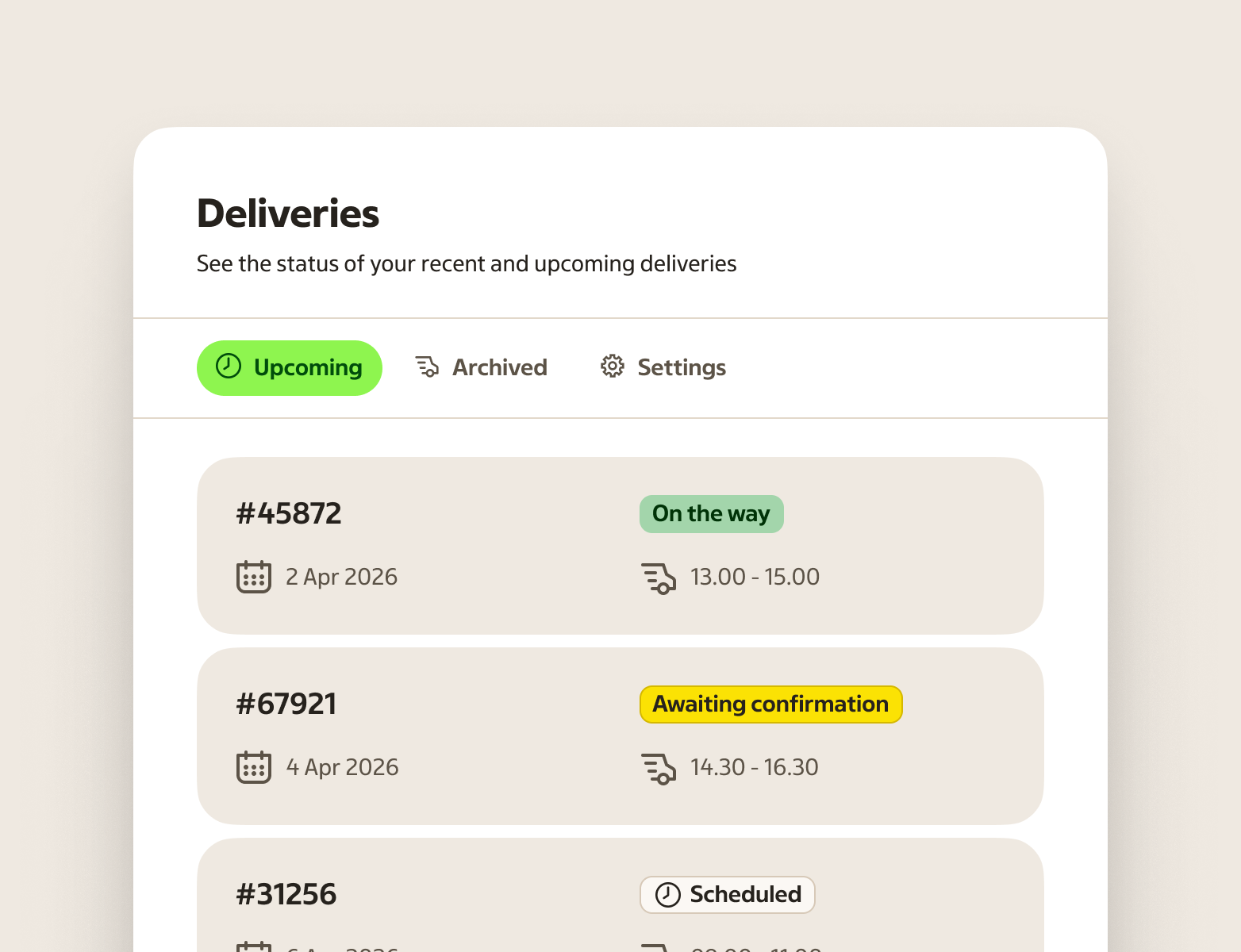
- Switching between parallel views of the same context — for example "Overview", "Details", "History"
- Organising content sections that don't need to be visible at the same time
- Page-level navigation within a section, subpage, or detail view
When not to use
- Sequential flows — use a stepper or wizard pattern instead
- Global navigation — use a navigation bar or breadcrumbs to move between pages
- Always-visible content — if users need to compare sections side by side, use stacked sections or cards
- A single tab — one tab is not tabs; show the content directly
- Deep navigation hierarchies — tabs work for one level of switching, not for nested navigation
Behaviour
Clicking or tapping a tab activates it and reveals its panel. Only one tab is active at a time.
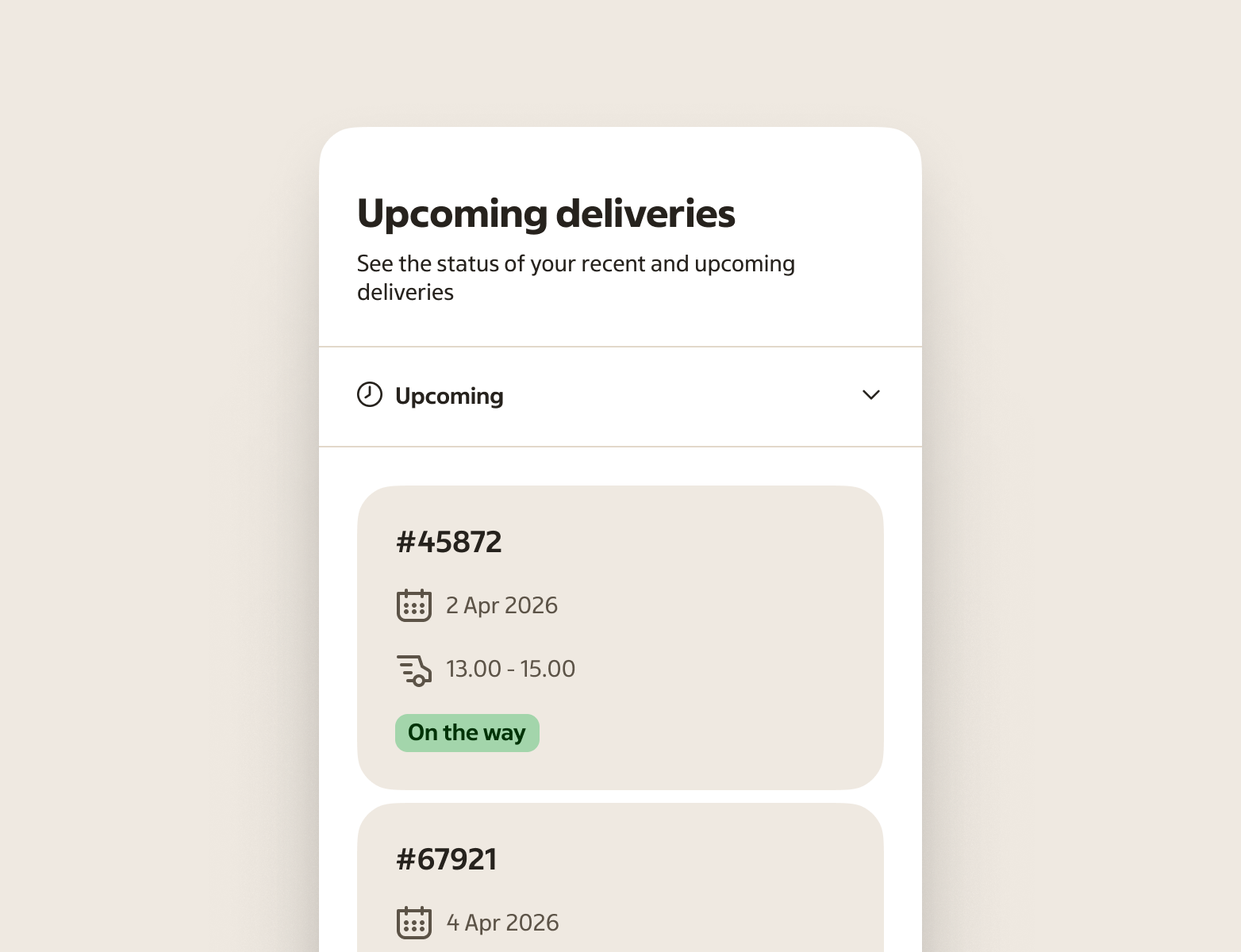
When the number of tabs exceeds what fits in the available width, the overflow mode activates. Remaining tabs collapse into a single overflow item that shows a chevron. Activating it opens a listbox where the user can select from the remaining options.
Keyboard: arrow keys move focus between tabs, Enter or Space activates the focused tab, and Tab moves focus into the active panel.
Keep the active panel stable. Avoid reordering tabs, changing labels, or moving the selected tab as the user navigates.
Anatomy
- Tabs container — a parent container teams typically add when placing tabs, to keep placement and layout consistent across different views
- Tab list — horizontal row that holds all tabs
- Tab — the interactive trigger. Contains a label and an optional leading icon. The selected tab shows a pill-shaped background.
- Overflow tab — shown when tabs can't all fit. Displays the current selection and a chevron. Opens a Listbox with the remaining options.
- Tab panel — content area that is revealed when a tab is selected
Variants
Content type
| Variant | Description |
|---|---|
| Text only | Label without an icon. Use when the label alone is clear. |
| Text + icon | Leading icon followed by a label. Use when the icon reinforces meaning — not just for decoration. |
States
These states describe when a tab is interactive, targeted, or selected.
| State | When to use |
|---|---|
| Default (unselected) | When the tab is available but not selected |
| Selected | When the tab is selected and its panel is the active section |
| Hover | When the tab is targeted by hover from a pointing device |
| Focus | When the tab has focus from keyboard navigation or assistive tech |
| Pressed | When the overflow tab is being pressed, before the action completes (overflow tab only) |
Placement & layout
Place tabs above the content they control. Keep them aligned with the left edge of the content area, or span the full container width.
- Use the non-overflow variant when five or fewer tabs are expected and the labels are short
- Use the overflow variant — or let it activate automatically — when many tabs exist or the container is narrow
- Avoid nesting tabs inside tabs; it makes navigation harder to understand
If most users will need to compare information across panels, tabs are usually the wrong choice. Show sections stacked instead.
Writing tab labels
Tab labels should tell users exactly what they will find in each panel. Keep them short, specific, and parallel in structure.
Do
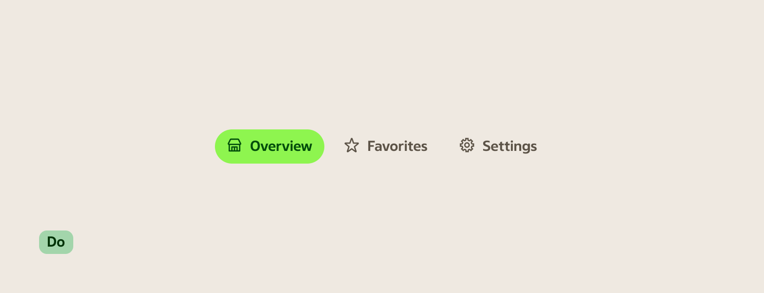
- Use noun phrases: "Overview", "Nutrition", "Orders"
- Keep labels to one or two words; three at most
- Use the same grammatical form across all tabs in a group (all nouns, or all short phrases — not mixed)
- Choose concrete words that match the content: "Ingredients", not "See what's inside"
Avoid
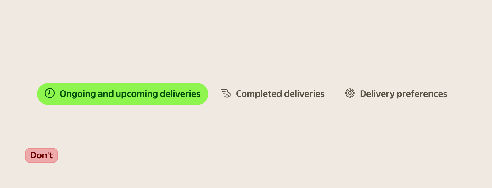
- Repeating the page title as a tab label
- Vague labels like "More" or "Other" for tabs that are always visible
- Verbs when a noun works: "Settings", not "Configure"
- Long labels that force truncation on narrow screens